15th September 2026
For the quarter final of Interior Design Masters we were split into pairs and tasked with redesigning a retail space.
Lia and I worked together this week on redesigning independent gift shop 'Oil & Oak' in Hay-on-Wye. This was a challenging brief due to the sheer amount of stock Oil & Oak carry, so we had to be strategic about the way we used the space.
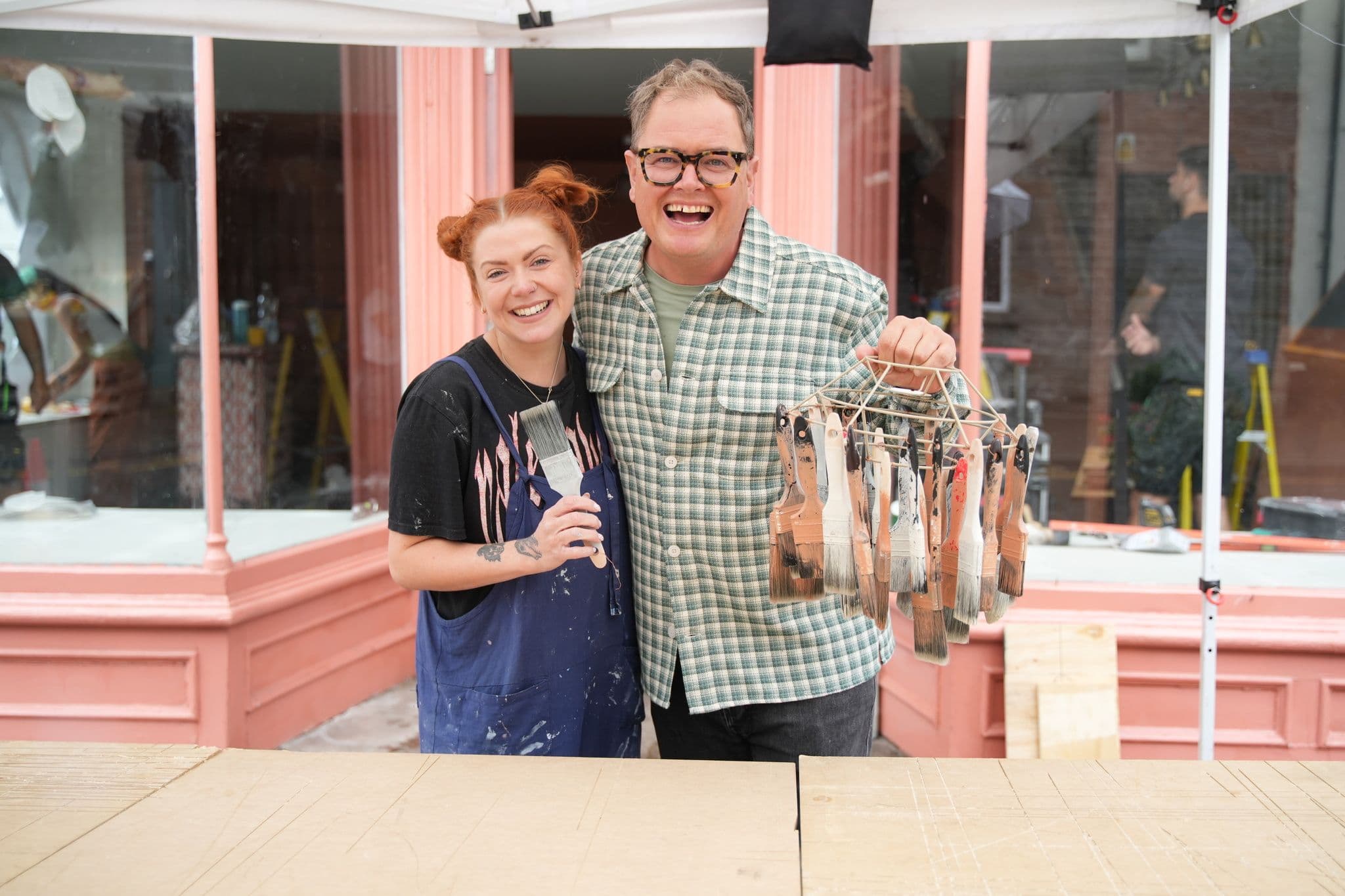
After speaking with the shop owner, Abi, it became very clear to me that Abi is so passionate about promoting all the wonderful artisans she stocks that her own brand identity was non-existent.
Having a background in running pop-up shops which champion small brands I could totally relate to Abi and her passion for indie businesses.
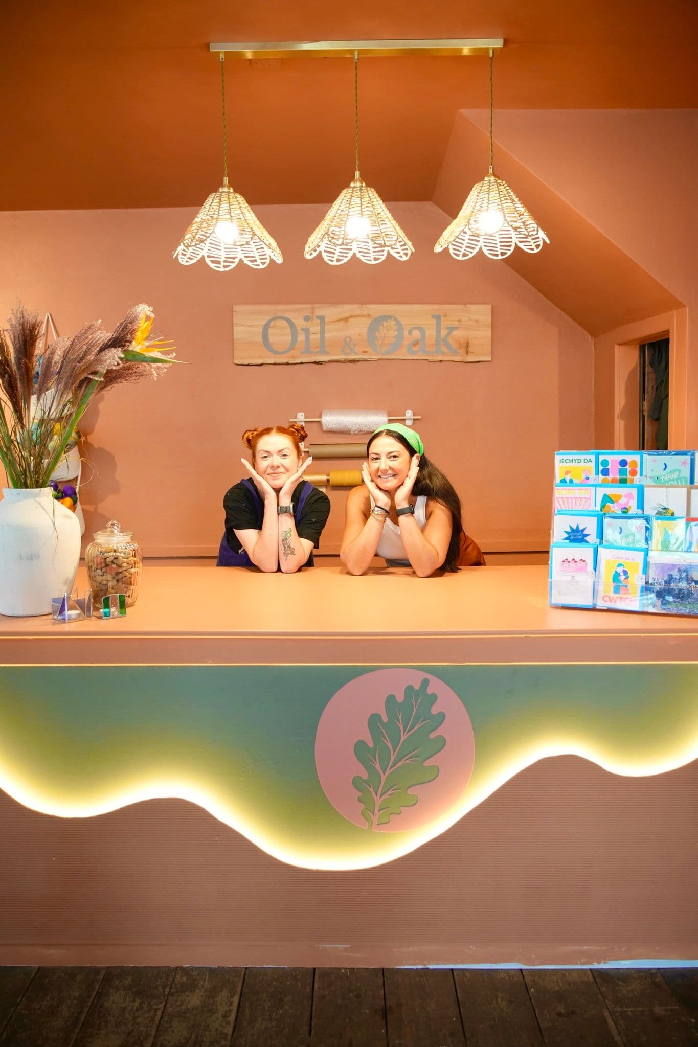
I wanted to make sure we were giving Oil & Oak its own branding so that when customers walk in they know exactly where they are, and are able to browse and shop the great vendors that Abi sells on behalf of.
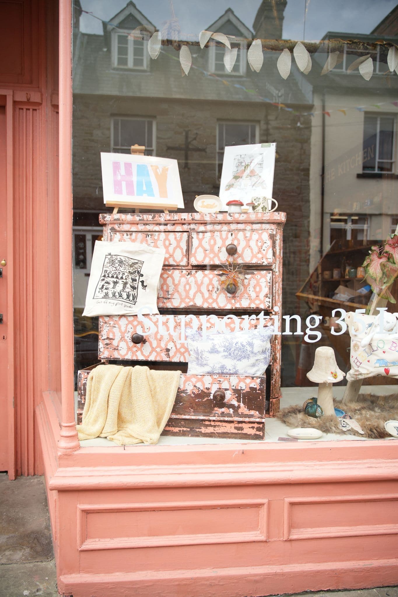
To tackle this mission, Lia and I split the shop into sections: Lia took the left hand side and the till area, I took the right hand side and the upstairs. We each had an enormous bay window to dress too.
My side of the ground floor was going to be displaying the vast ceramics collection along with tea towels and hand-woven bags.
I immediately knew I wanted to design a bespoke shelving unit which would be the 'kitchen' area of the store. The problem the shop had previously is that there was so much stock jumbled up and crammed in every where you looked.. we needed to give customers a 'snapshot' of the store when they walk in, by quickly scanning the room they will know where to head for what.
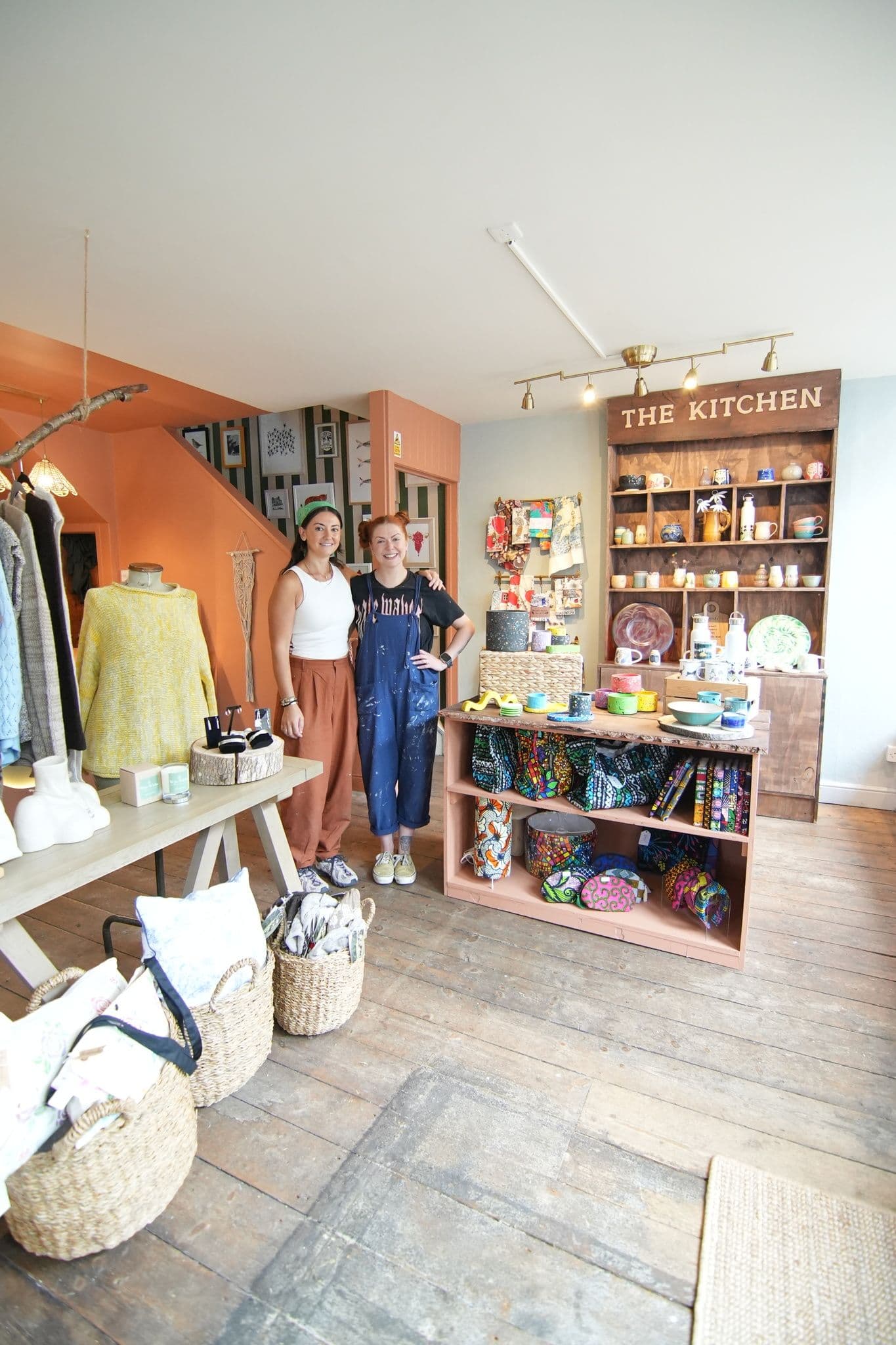
My bespoke unit was a contemporary nod to the traditional welsh dresser. It included storage space underneath for surplus stock and shelves up top to proudly display the pieces.
I was also in charge of the stairs and landing space which was previously used as a gallery and more storage space.
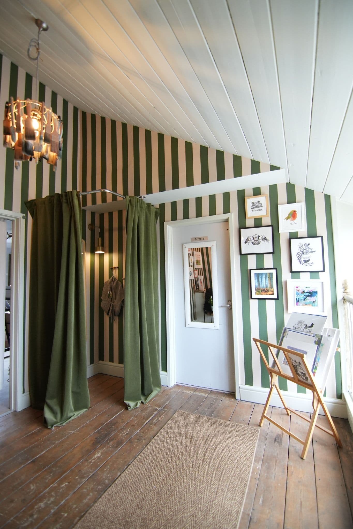
I decided to utilise the landing to create a custom fitting room, something the shop didn't previously have. I kept the idea of the gallery space but rearranged the artworks into a format that was more pleasing on the eye. I added a stripe wallpaper which enhanced the gallery wall and used browning wax on the bannister and spindles to make it look like they'd been restored from years of gloss paint back to wood.
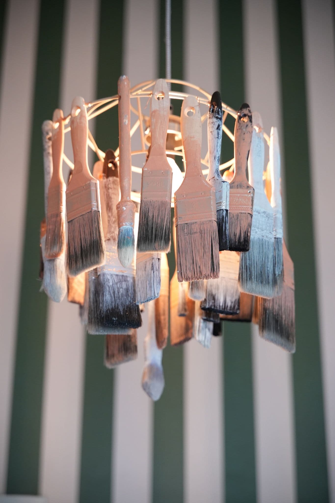
I also created a bespoke paintbrush chandelier for this space, which was a nod to the creative workshops that happen in the adjoining rooms upstairs.
In a joint effort, Lia and I rebranded the store and chose the colour scheme together. Abi told us she was drawn to the clay pink she had used on the exterior of the shop as it was resemblant of the clay soil of the local area. We decided to keep that colour and introduce a beautiful mid-green to contrast which was inspired by the vast green space surrounding the area.
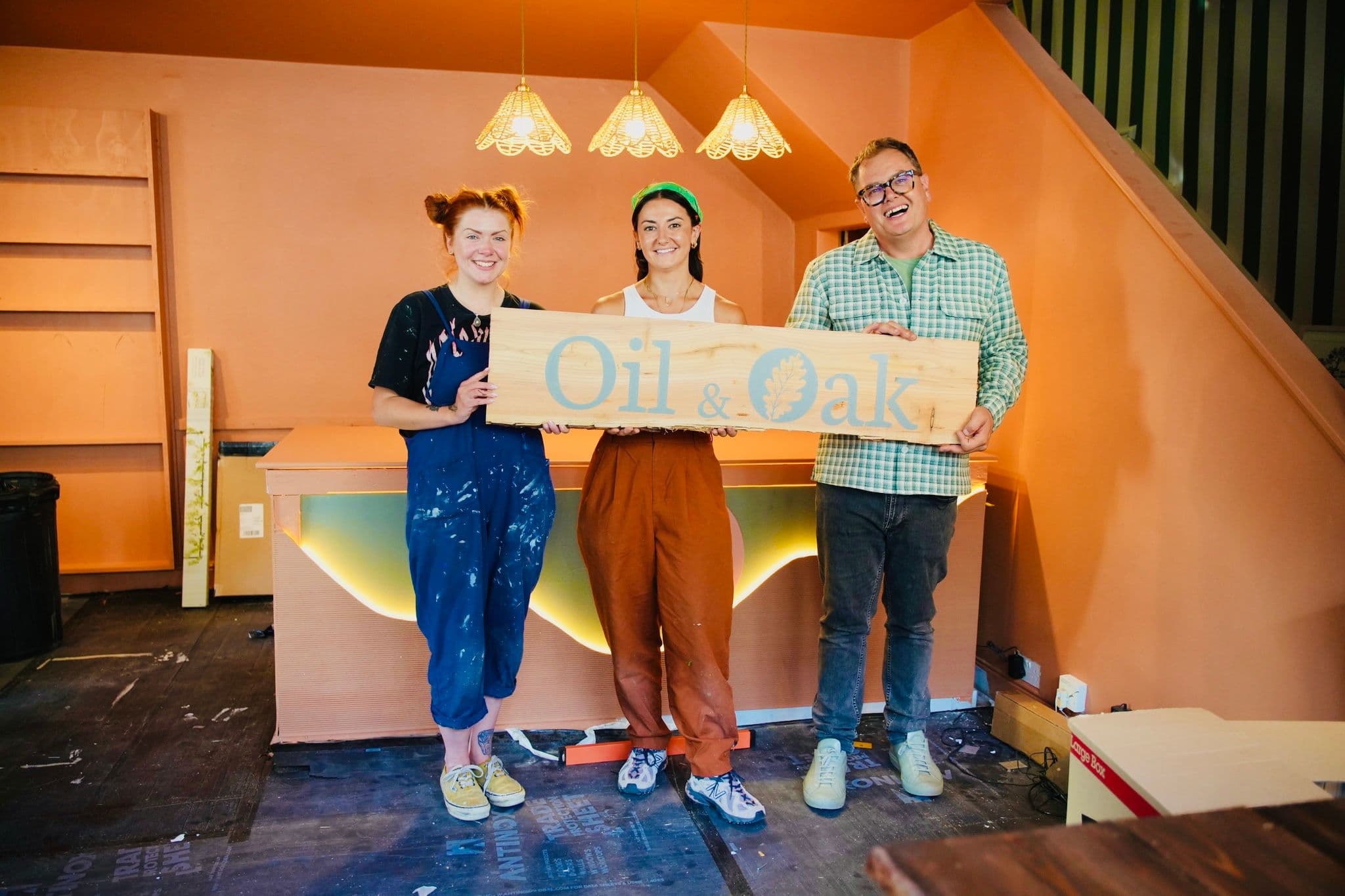
We also redesigned the logo and had new signage made so that Abi had a very intentional brand which reflected the work she does.
The biggest test, of course, is not what Michelle Ogundehein thought, but whether or not we had made Abi happy.
Her reaction upon seeing the space for the first time was amazing and something I'll never forget, she still to this day posts about us and the transformation and I'm so honoured that we were able to design her gorgeous shop for her.
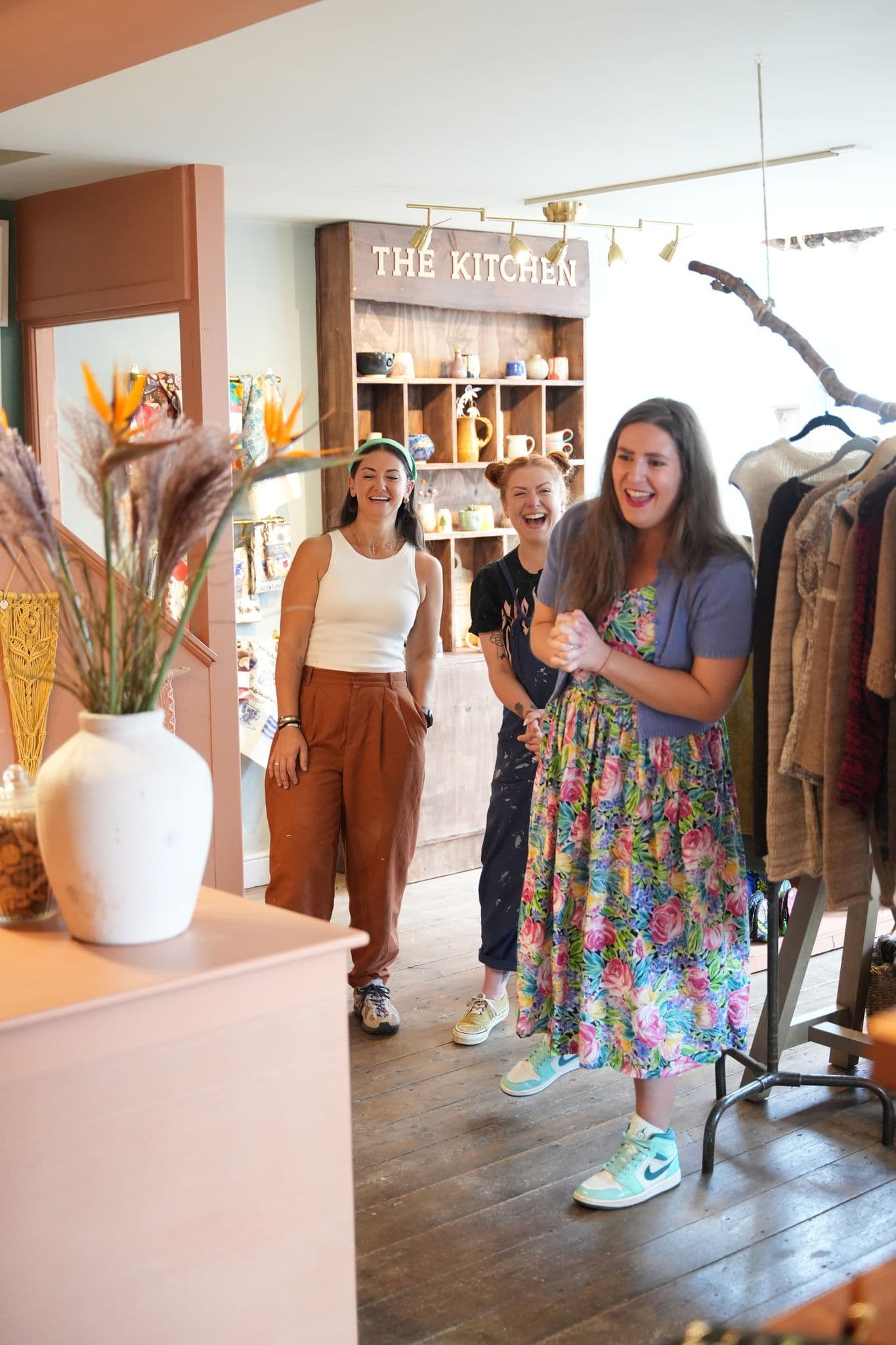
One of the best weeks I had during my entire time on the show and I can't wait to go back to Hay-on-Wye one day to see Abi again!

Similar
Projects